
Animated racing bar charts from your data
Turn numbers into a scroll-stopping racing bar chart video — or a head-to-head comparison — with smooth animation, branding and captions. No spreadsheets-to-After-Effects pain.
- Classic bar chart race or head-to-head VS comparison
- Smooth, broadcast-style animation from raw numbers
- Title, accent color and captions baked in
- Vertical or wide export for Shorts, TikTok and YouTube
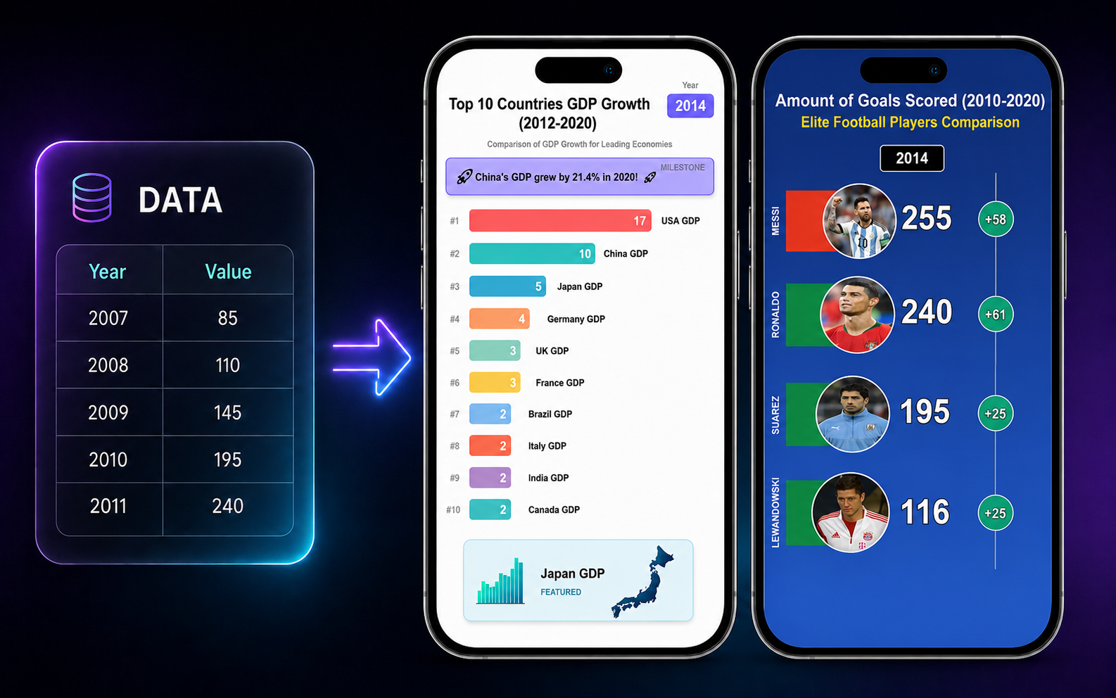
StoryMorph’s racing bar chart maker animates your data into the format that performs on Shorts and TikTok: a classic bar chart race, or a head-to-head VS comparison. Add a title and accent color and export — no design software, no manual keyframing.
How it works
Add your data and title
Categories and values, plus a headline and accent color.
Pick a style
Classic racing chart or head-to-head VS.
Generate and export
Download an animated, captioned chart video ready to post.
Frequently asked questions
What is a racing bar chart video?
An animated chart where bars grow and reorder over time to show how values change — a popular, high-retention format for data stories.
Can I do head-to-head comparisons?
Yes — StoryMorph supports both a classic bar chart race and a two-item VS comparison.
Do I need design software?
No. You provide the data and StoryMorph animates, brands and captions it.
Is it free to try?
Yes — start free with included credits.